TYPE can have a bigger impact than you think.
What do you think of when you hear the word “typography”? No, we’re not talking about maps and Earth’s surface shape, we’re referring to the beautiful jumble of letters on your computer under the fonts panel. Think about your business and how you communicate with your customers. Do you have pamphlets, business cards, or brochures your customers will actually go to for information? If the answer is yes, then you should consider what message the fonts you use are sending. Let’s take a more in-depth look at how type can help and hurt your brand and business.
Legibility
Whether it be headlines, body copy, pull quotes, or anything in between, legibility is vital for effectively communicating your message. Take for instance this flyer below, can you quickly draw from it what it’s advertising? It’s difficult because there is a lack of balance and variety in the type. We can confidently tell you that this would be looked over more times than not. Imagine yourself as someone who sees this poster, would you call and ask for this service or would simply overlook this flyer because it’s hard to read?
[efsthumbnail sdsd src=”https://focalpointmarketing.com/wp-content/uploads/2015/11/bad_flyer.jpg”]
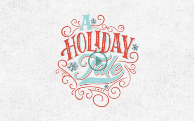
Let’s make this easier to understand.
[efsthumbnail sdsd src=”https://focalpointmarketing.com/wp-content/uploads/2015/11/good_flyer.jpg”]
This flyer/invitation has much more interesting qualities than the previous one we’ve looked at. The title as well as supplemental details are all clearly defined through the use of size of type, diversity in font choice, and execution of a hierarchy. Visually it’s much more stimulating and inviting.
Art & Science
Great typography can sometimes be the result of blending art and science. In the example below, this stylized hand drawn type is visually enchanting. Think about your audience, think how they consume information. Depending on what medium you are using to communicate to your customers and what exactly your message is, stylized headlines and copy can be a suitable practice. Be sure you are well aware of what you are trying to accomplish before pursuing this.
[efsthumbnail sdsd src=”https://focalpointmarketing.com/wp-content/uploads/2015/11/jack_d.jpg”]
Flow
Not every instance of typography in design can be big, beautiful headlines. Often there are situations where large amounts of body copy are unavoidable. Flow is the overlooked trait in good typography. Pick up any magazine or publication close to you. Now flip to a random page and look at how the page flows from one to the next. Take a second to see how not only the body copy but how headlines clearly draw a visual line from one article to the next. Observe how images are used or not used. Your customer should be able to easily pick up a piece of collateral from you and sift through it without having to redirect constantly.
Final Thoughts
Always be aware of how typography and font choice can impact anything that you have made for your business or brand. Having solid brand standards will assist you in what font choices are made and how they are used throughout all facets of your business. If you’re looking to strengthen your brand’s perception, and possibly grow your audience, we suggest putting more thought into how your typography choices are communicating to your audience. Are they enhancing and supporting it, or detracting? You might be surprised at what you find.
Looking for assistance with your business?
Get in touch with us now and sign up for our newsletter to get latest news and updates!
[efspanel style=”” type=””]
[efspanel-content]
Get the latest and greatest, right to your inbox.
[mailchimpsf_form]
[/efspanel-content]
[/efspanel]